The Number One Mistake We See Creatives Make
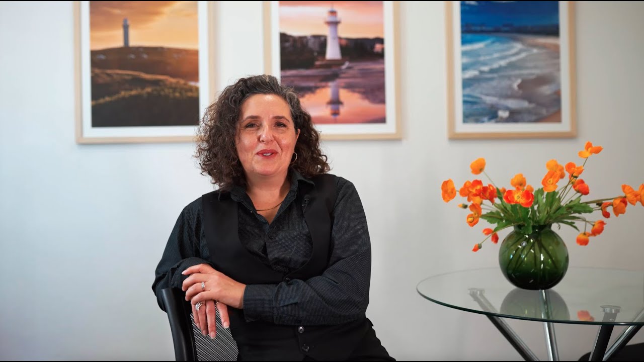
Watch the video to hear from our Creative Director, Lee Taylor.
The biggest mistake we see creatives make is prioriting style over strategy.
Too often, designers jump straight to what looks cool or trendy rather than taking the time to understand the business problem they’re meant to solve. Creativity alone isn’t enough. The work needs to have purpose.
For example, instead of uncovering why a client feels they need a new logo, some designers simply create a more visually appealing version of what already exists. While it may look nicer, it doesn’t necessarily add value or address the underlying issue the business is facing. Or when a client asks for a new website, the creative should dig deeper: What isn’t working with the current one? What goals aren’t being met? What problem are we trying to solve?
The simplest solution is also the most overlooked: ask “why?”
Asking the question gives creatives the clarity they need to diagnose the real issue and recommend the right solution. A client who thinks they need a full website rebuild might actually need a conversion-driven landing page, better content, improved UX, stronger social media presence or a targeted ad strategy.
Instead of producing work that only looks good, this approach ensures every creative decision is backed by strategy, business goals, and a clear path to proven results.
Case study
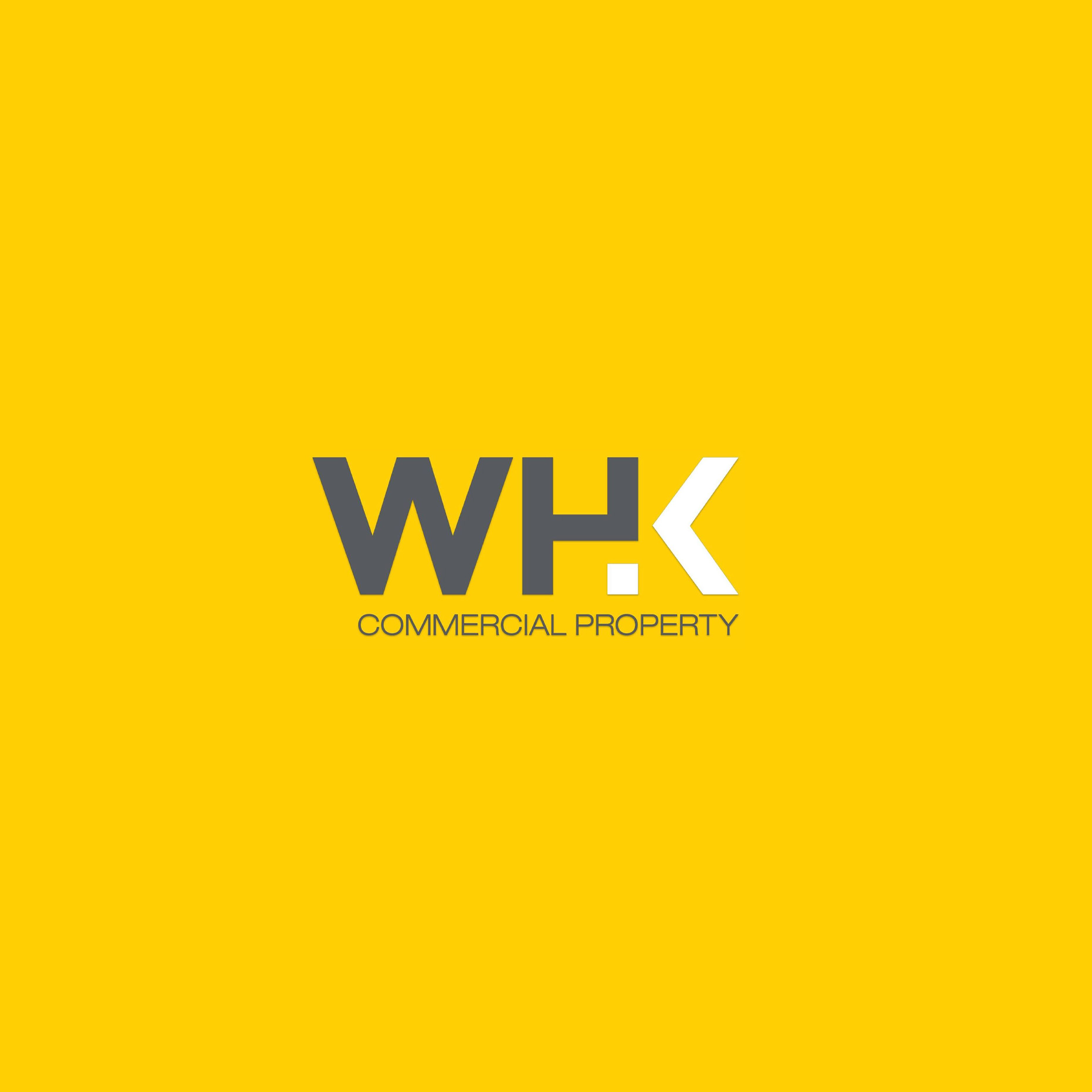
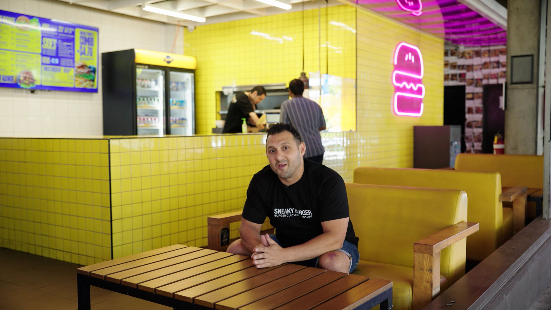
WHK Commercial Property
WHK Commercial Property came to us feeling their brand was lacking alignment with their industry experience and market leadership. They wanted a modern look and a McDonald’s-inspired branding strategy by focusing on a recognisable emblem, leading to enhanced brand recall.
We completed a comprehensive rebrand to project a professional image in commercial real estate, keeping brand recognition through their main colour but with a different application. We identified that by inverting the “W”, this created a warehouse silhouette, becoming a hero emblem and key brand element across their collateral.
Case study
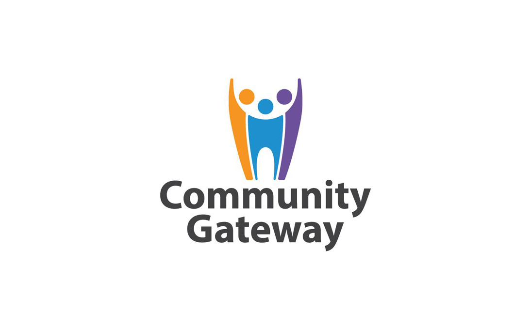
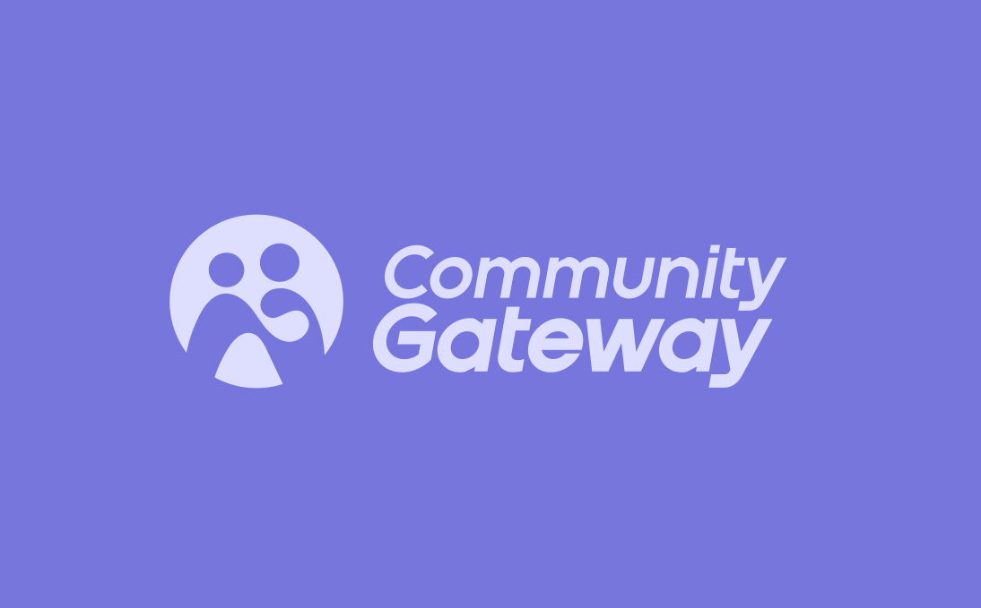
Community Gateway
Community Gateway felt their existing brand was dated and generic without reflecting their values. The logo also felt disconnected as a brand identity from their different entities. To create an inviting and inclusive brand, we focused on a people-centred approach. We started by understanding the needs of their aged care and disability audiences, identifying key values like trust, dignity, and belonging.
We shaped a brand personality that feels warm, supportive, and modern, avoiding anything overly clinical. The soft, rounded forms represent connection and care, making the brand approachable from the first glance.
Accessibility was a priority, so we used clear typography, high-contrast colours, and simple shapes to ensure the identity works for people of all ages and abilities. The result is a brand system that feels friendly, inclusive, and reflective of the support Community Gateway provides.
Case study
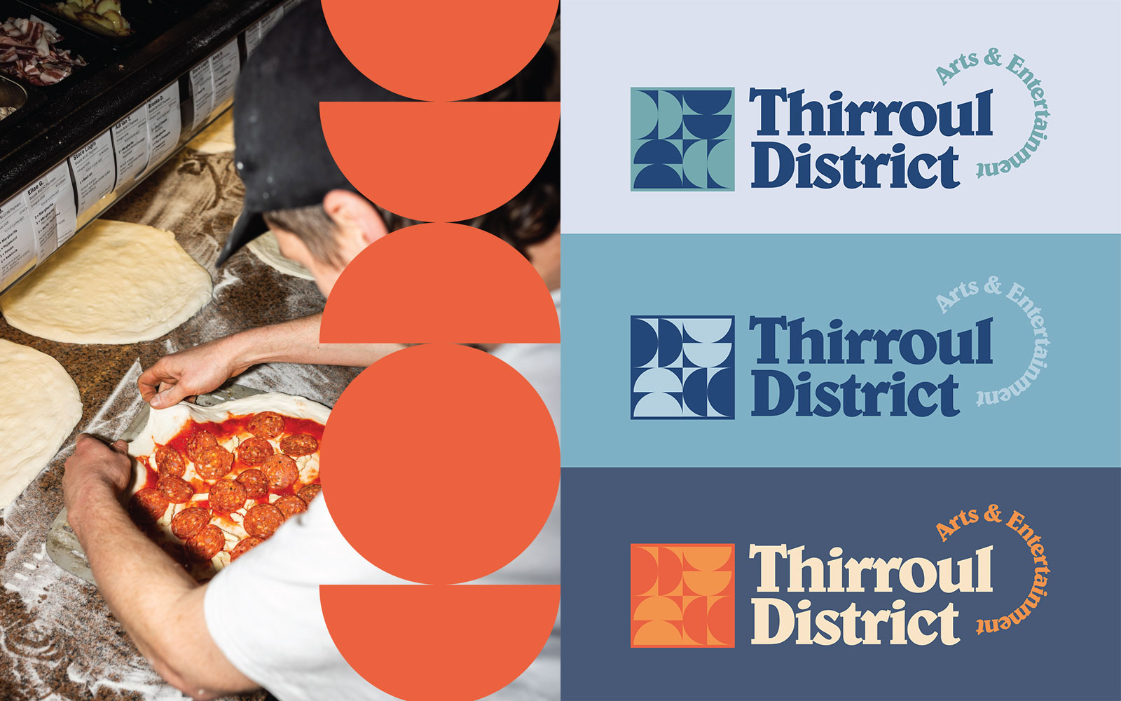
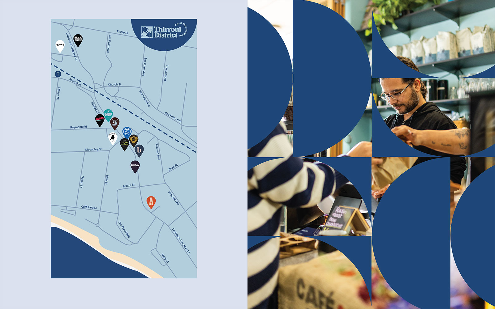
Thirroul Arts & Entertainment District
Thirroul Arts & Entertainment District needed a brand that could represent the unique character of the coastal village, while uniting two very different audiences: local creatives and service-based businesses. The challenge was to create a brand that felt vibrant and approachable, without leaning too far into either “arty and creative” or “professional and corporate.”
We developed a fresh brand identity that celebrates Thirroul’s coastal charm and creative culture, while still appealing to established businesses. The brand system includes a flexible suite of graphics and colour palettes, and is designed to work across all marketing channels, including website, digital advertising and social media. The result is a versatile brand that captures the vibrancy of the community, supports local businesses, and helps Thirroul present itself as a hub for culture and community.
What this means for you
If you’re a creative working with clients, always start by asking why. Why do they want this? What’s the real issue they’re trying to solve? When you dig deeper and identify the true challenge, you create a brand that’s strategically aligned, future-proof and meaningful, not just something that looks good. That’s how you deliver a rebrand with purpose, clarity and long-term value.
If you’re a client looking for a new service, choose a team that genuinely wants to understand your challenges. You know your business better than anyone, so speak openly about what’s working, what’s not, and what you want to achieve. A good creative team will listen, ask the right questions and help uncover the real problems to solve. If they don’t listen, they’re not the right fit.
Be the first to hear our insights built for real business growth
Trusted by
Our portfolio is built on long-standing partnerships with brands that value creative thinking and meaningful outcomes. Below are some of the clients who have trusted Unknown Group over the past five years.
Posted onTrustindex verifies that the original source of the review is Google. I’ve been working with Unknown Group Marketing since January this year and they’ve been an absolute game-changer for my business. The team is proactive, organised, and genuinely invested in helping us grow. They take the time to understand our brand, communicate clearly, and consistently deliver high-quality work without needing to be chased. What I’ve appreciated most is their ability to turn ideas into real, measurable outcomes — from strategy through to execution. They’re creative, reliable, and easy to work with, and they feel more like an extension of our team than an external agency. Highly recommend Unknown Group to anyone looking for solid, effective marketing support.Posted onTrustindex verifies that the original source of the review is Google. We were able to amplify our winter destination marketing campaign with the skills of unknown group. The team were so easy to deal with and the results speak for themselves!Posted onTrustindex verifies that the original source of the review is Google. Trent and his team at Unknown Group have been incredible to work with. They completely transformed our digital presence — from building a world-class website to managing our marketing, videography, Instagram, Facebook, and content creation. Their attention to detail, creativity, and professionalism are second to none. What really stands out is how much they genuinely care about the success of your brand — they go above and beyond every single time. If you’re serious about taking your business to the next level, I couldn’t recommend Unknown Group highly enough. Trent and his team are the real deal!Posted onTrustindex verifies that the original source of the review is Google. We’ve been working with this team since day one, and three years later we’re still in business together. They’ve been consistent, reliable and easy to deal with the whole way through. They understand our goals and actually listen, which has made a big difference to our growth. Clear communication, steady results and a partnership we value. Happy to recommend them.Posted onTrustindex verifies that the original source of the review is Google. The team at Unknown Group have been such a pleasure to work with. They made a genuine effort to understand what my business is about and helped bring that to life in a way that feels authentic and true to my brand. Their advice and strategies are creative, practical and thoughtful. The team are very friendly and easy to work with. Highly recommend to any local business wanting to promote their work.Posted onTrustindex verifies that the original source of the review is Google. The Unknown Group have been brilliant in assisting us to transform our image and improve our brand identity. The various strategies have meshed well with our management and we have been able to achieve significant strategic gain and lift in our sales. This has been an ongoing effort and wouldn't be possible without the acumen and commitment from Trent, Caitlin and the team. Highly recomend The Unkown GroupPosted onTrustindex verifies that the original source of the review is Google. Unknown Group has been fantastic to work with! Their level of expertise and professionalism is second to none. We used them to launch our website and branding, and the whole process was seamless from start to finish. Trent and the team were knowledgeable, responsive, and great to work with. Highly recommend Unknown Group to anyone looking for marketing.Posted onTrustindex verifies that the original source of the review is Google. I’ve worked with Unknown Marketing Company across multiple business ventures, and I can confidently say they are one of the best marketing teams I’ve ever partnered with. They helped me take each concept from idea to full execution, everything from SEO, branding, logo design, creative direction, and full marketing strategy. What really stands out is their in-house team. They’re modern, switched on, and understand exactly how today’s market responds visually and emotionally. Their insight, communication, and consistency have been on point from day one. I couldn’t recommend them highly enough, truly a 10/10 experience. Thank you to the entire team for always being there and going above and beyond. I’m grateful to have you guys in my corner.Posted onTrustindex verifies that the original source of the review is Google. Always awesome dealing with Trent and the team